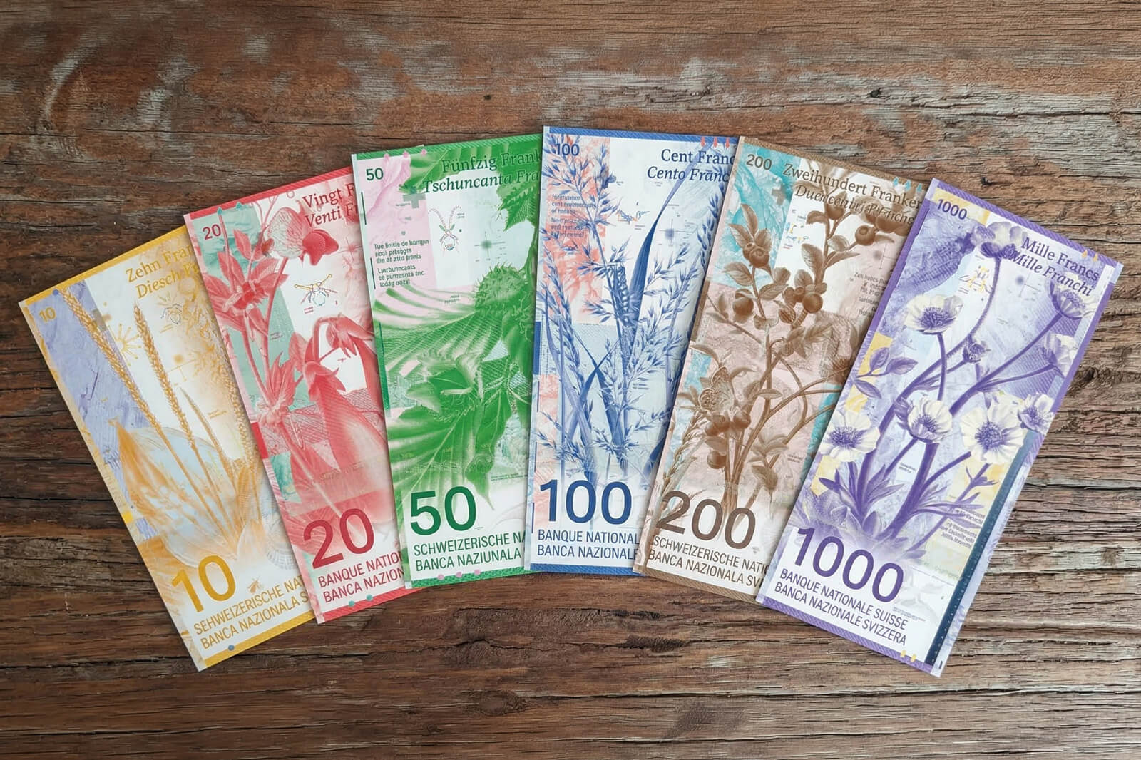
Switzerland abandoned human portraits on its banknotes. Instead of presidents and writers, you get butterflies, snow crystals, mountain landscapes, and slalom racers.
It was a bold call, and it worked.
The current ninth series, launched between 2016 and 2019, is not only visually striking. It is also one of the most security-rich sets of banknotes ever produced.
I wrote this guide to showcase what makes Swiss banknotes quite special, and why they are unique in the world.
How the Current Swiss Banknotes Came to Be
The Swiss National Bank launched a design competition for the new series back in 2005. The winning entry came from designer Manuel Krebs.
It featured cells and embryos, which created quite a loud public response.
The SNB then revised its decision and went with the second-place design instead: a concept by Zurich graphic artist Manuela Pfrunder, which became the ninth series we use today.
The color scheme was kept identical to the previous series to help people identify denominations at a glance. The new notes were made slightly smaller than their predecessors. And the design moved away from portraits of people entirely - the first Swiss series to do so.
As of 2026, we are still using the ninth generation of banknotes in Swiss history. The first series launched in 1907, with the typical lifespan of a Swiss banknote series being 15 to 20 years.
If you're interested to learn more about the Swiss coins in your pocket, some of which look almost identical to coins from the 1870s, check out my other guide:
Swiss Money: Coins, Banknotes, and Fascinating Facts

7 Interesting Facts About Swiss Banknotes
Most people never look closely enough. Here is a rundown of the main security features on a Swiss banknote:
- A glossy strip on the 50-franc note showing a map of Switzerland and the names of the main four-thousand-meter peaks. Tilt the note and tiny Swiss crosses appear in rainbow colors. Tilt it further left to right and red and green numbers slide across four lines in opposite directions.
- Micro-lettering hidden at multiple points on each note: Texts in four languages, readable only under a powerful magnifying glass
- Perforations shaped like numbers and crosses punched through the paper. Hold a note up to light and you will see them
- A coating that transfers faint traces of color onto white paper when you rub the note
- Features only visible under UV or infrared light
- The newest bills are designed to transfer traces of color onto white paper when rubbed
Each of these features has a purpose: To make professional counterfeiting as difficult as possible, and amateur counterfeiting essentially impossible.
Wait, Can Swiss Banknotes Be Counterfeited?!?
Yes, they can. In 2016, Swiss authorities confiscated over 8,000 counterfeit bills and coins with a total fake value of nearly 400,000 francs. Twelve people were convicted of counterfeiting; 95 for circulating false money.
But the fakes were super poor: Over 1,000 were simple color photocopies, the rest inkjet printouts! Neither comes close to the standards of real Swiss banknote production.
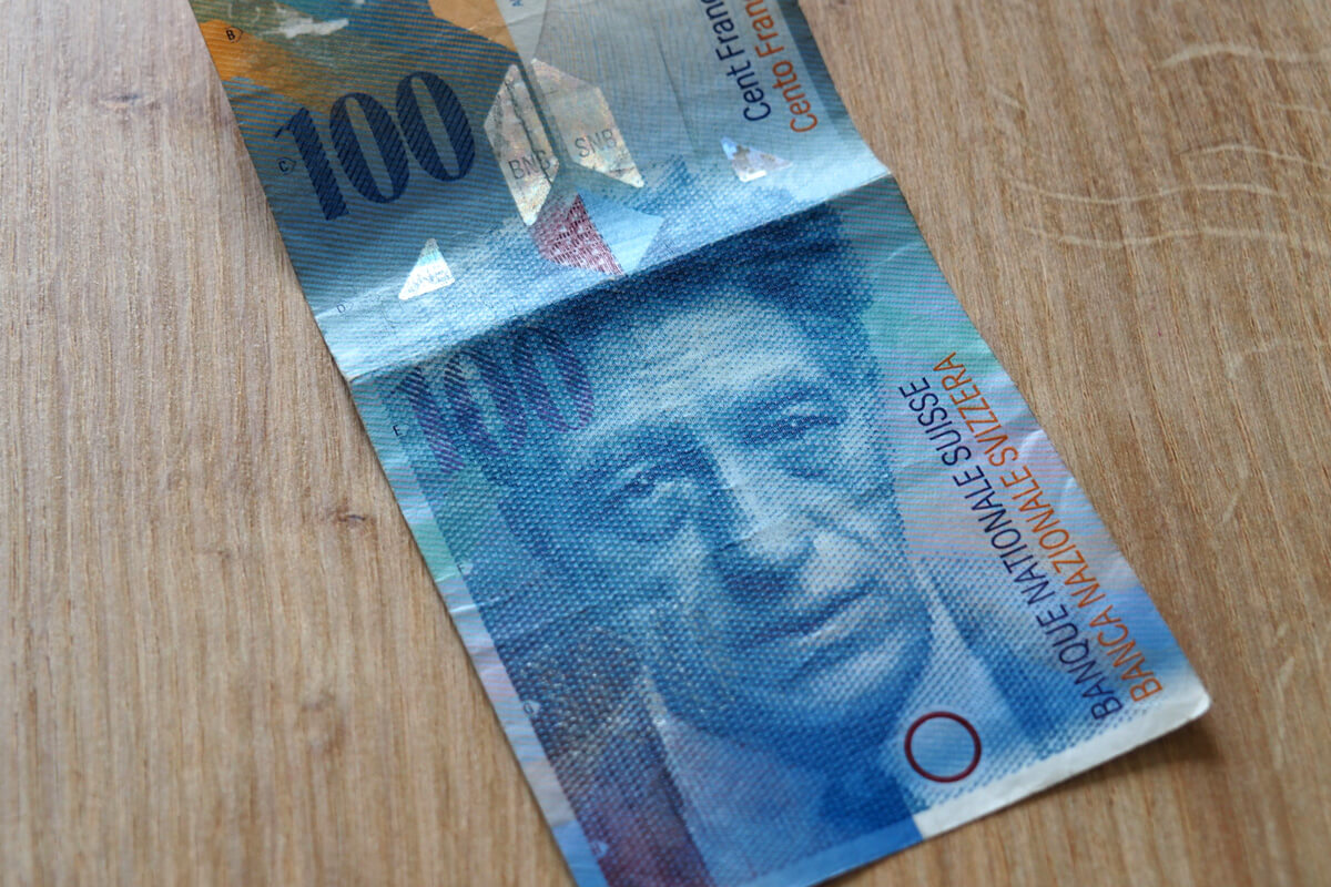
PS. Once you see the face on the new 50-franc bill, you cannot un-see it!


is that a HOLE in the bill or just a transparent part?
It’s some kind of transparent security feature…
I liked the actual winner of the design competition! But I can see how Manuel’s design might come across as a tough too avantgarde and potentially even disturbing. Manuela’s design is obviously more conservative but still nice.
I quite like this new design. As for the winner, I find the grey objects on the notes feel like they don’t really belong there.
I’m not surprised about fact number five. Perhaps the counterfeit rate for the British pound is so is low because it’s a coin!