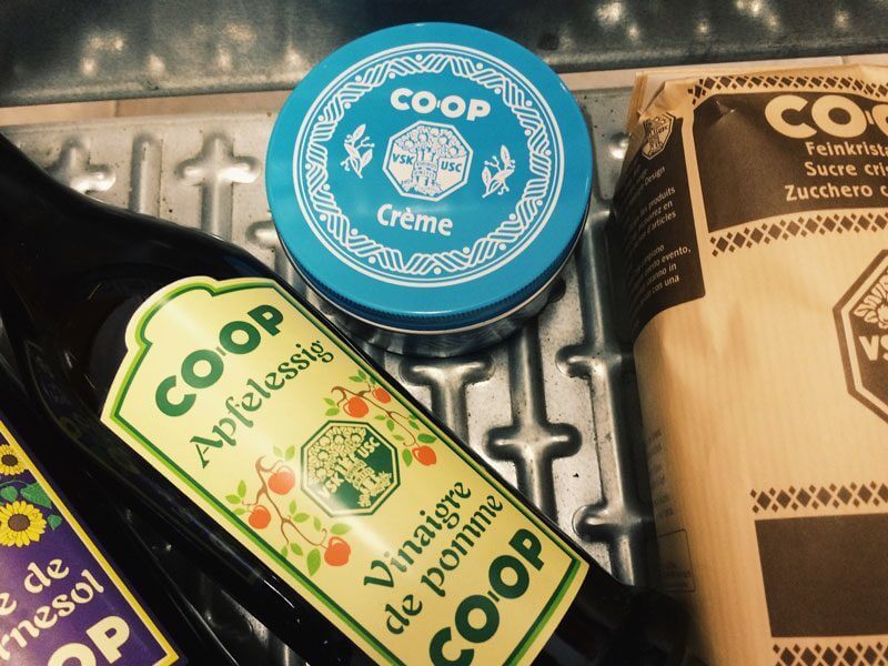
Retro design is definitely making a comeback. So when I spotted some vintage looking products on the shelf of my nearest Coop, I thought it was some new cool design brands just released on the market.
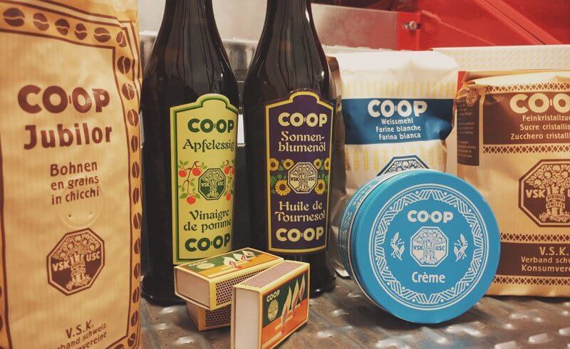
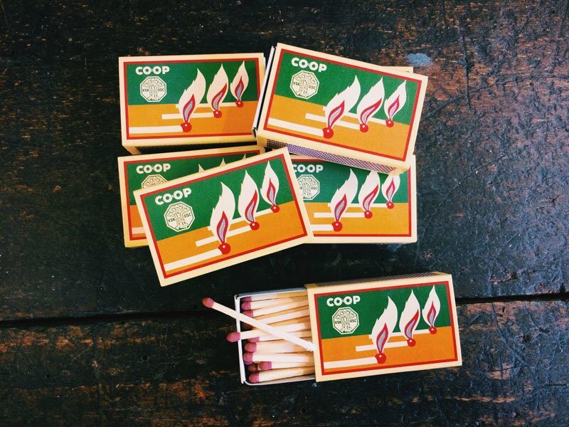
I had to make a double take: I was actually looking at an original vintage packaging by the Coop private label brand! There are plenty of Coop branded products that have been re-issued with their original packaging from 1914. This is the year when Coop's private labels were released for the first time.
The Self-service Shopping Experience
I love the fact the private labels have a reassuring quality to them: The design is different and yet you feel a sense of uniformity in seeing them all together. I love to think that people back then were just adjusting to the new concept of "self service" stores.
It was a new idea that you would no longer request goods directly from the store owner from behind the counter. Instead, you would browse through the aisles and help yourself with whatever you needed.
Portions and packaging had to be re-invented to help people purchase. Coffee and rice were no longer scooped from a big container, weighed and packaged. Instead, these products were offered pre-weighed and packaged - ready for purchase.
As a consequence, the packaging design had to reveal what is inside a box. The design also had the purpose of "convincing" someone to make a purchase, since the choice was now up to the consumer. Buying products of a standardized, elegant, yet unassuming appearance instills a sense of safety. In a way, this still holds true today when we buy private label products.
Amazing Design and Details
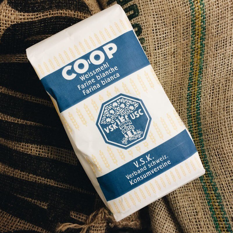
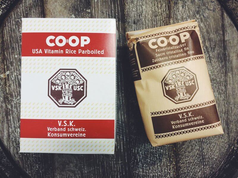
The thought that this design is 100 years old is mind blowing. The look is totally modern and could well be used in stores nowadays. The fonts are simple and elegant, and I love the little details like the rice grain pattern for the Vitamin Rice, the coffee bean frame for Jubilor Coffee or the sheaf pattern for the flour.
The brown kraft look for sugar and coffee. It really brings you back in time, and yet it would feel completely modern and proper in a supermarket shelf today.
Of course, if you have ever watched the TV Show "Lost", it will strongly remind you of "Dharma" branded products. But not necessarily in a bad way.
My personal favorite? Why, the hand cream of course. Light blue and an stylish white pattern in a neat little tin. Plus, the hand cream is awesome, too. Just like every other Coop labeled product: You not only get the design, but also a good price-to-quality ratio.
This is a really inspiring packaging experience. Thanks, Coop, for bringing these designs back and turning retro into the new modern!



Oh they look fab. You could make up a lovely gift basket with them too. I’ll keep my eye open later in Coop. Thanks for sharing.