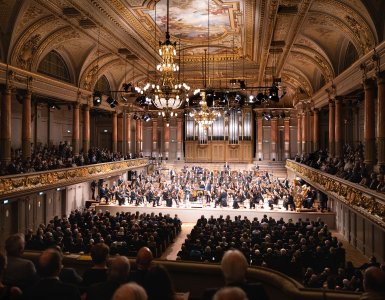
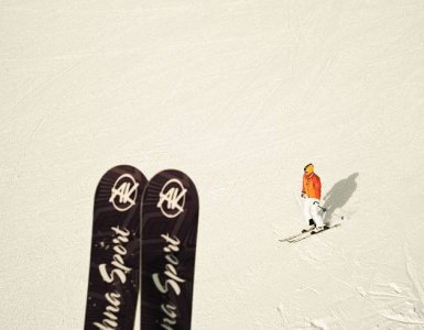
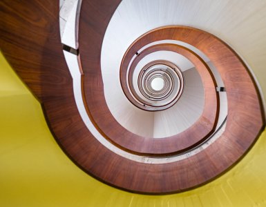
Ironically, it took a long time for me to get around to writing up my conversation with Ruben Feurer. The irony is that I was ostensibly busy, illustrating exactly the kind of jaded appreciation for "the beauty around us" that the Dear Zurich project is meant to remedy.
But I am ready now. And you need to know about Dear Zurich.
Ruben is one of the creators of Dear Zurich, an elegant and deceptively simple interactive web canvas that kindles the desire to slow down and appreciate scenes from Switzerland's largest city.
Dear Zurich was designed by Y7k, a digital design team that travels quite a bit. Amazingly, all the footage was filmed in a single day. Y7k's conversations about travel and the care we take to look deeply at a new city inspired Dear Zurich.
Dear Zurich is a visual love letter.
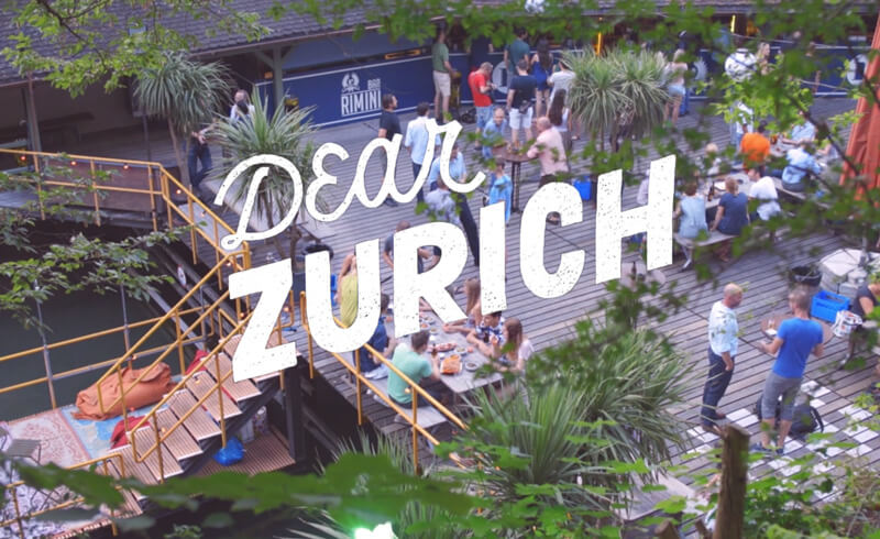
The city Ruben and the all-Swiss design team have captured does not feel large. It is an ideal garden café, little girls in white dresses playing in the sun. It is green-clad urban space made for pedestrians and bike riders, sprinkled with crushed rock. It is the first truly warm day of the year when you can finally reach for that tank-top or slide back into your flip-flops.
Dear Zurich is nostalgia for what is now, a Fernweh for where you are. Dear Zurich is a visual love letter, reminding us to slow down. You do not need to check TripAdvisor or Yelp. The place on the corner you have walked past three times today would be perfect for a drink after work. You are here, present, and it is magic.
Click through a few random scenes on Dear Zurich. I'll wait.
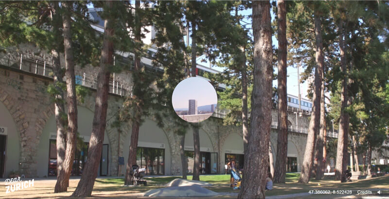
Back already? Did you really take your time? Ok, so you did. Did you notice how to find GPS coordinates? What about that waitress bringing out a plate, what did you imagine they ordered? The view of the café, set against the bottom-up view over the gravel and piping fountain one scene later?
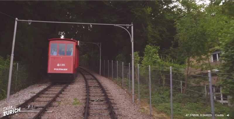
There are over twenty different looped scenes, and unless you start fiddling with the address bar in your browser, there are infinite random combinations of scenes and experiences.
The beauty of Dear Zurich is twofold. It is a window through the lens of a Canon 5D into a series of ever repeating moments, one cycle of the city in all its vibrancy and variety, breathing in and out on a warm summer day.
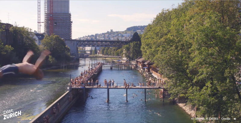
But that is not the point. This should be about your town. Your city. That bridge you crossed yesterday, the parking lot at work with the low-slung trees, your local swimming pool. Dear Zurich is both an homage to the less touristy Districts 4 and 5 in summer, as well as a call to re-examine all public spaces, to slow down and find the magic in your everyday.
I encourage you to take an extra moment on your commute today and design your own love letter, whether it be Dear Bellinzona or Dear Boston. Capturing a moment has fleeting value. Opening your eyes to appreciate your surroundings? "All the magic lies therein — no matter how accustomed they may seem."
Although Dear Zurich is meant to be a random interactive experience, you can steer yourself to individual scenes to make sure you do not miss any.
Do you want something more quiet? My favorite is this one.
Ruben expressed that "Dear Zurich is not meant to be a visual map for exploring Zurich, but an inspiration to wander." He did suggest the area around Idaplatz in District 3 and the view from the area around the Stadtspital Waid as good places to start for any would-be explorers...

